Valle dei Calanchi, Italy

We are so excited and proud to announce the Partners in Design Climate Action Fellowship!

For years, we have been inspired by the work of the Civita Institute—a nonprofit organization that promotes and inspires design excellence through cultural exchange between the United States and Italy—that awarded a fellowship to one of our partners in 2012 at a critical time in her career.

To pay it forward, and following the recent announcement that Italy is set to become the first country to require mandatory 33 hours of climate-related lessons into public school curricula, we decided to sponsor a new fellowship through the Civita institute, to increase awareness of our changing climate and encourage actions that can be taken by architects, planners, designers, artists, writers and other arts professionals to contribute to a more sustainable societal response.

Since the founding of our office, we have made it a point to take on certain projects on a pro bono basis that have the potential to really make a difference in our community. It’s one of the most important reasons why we design—to care for the earth, to foster diversity, humanity, equal rights and access to education—and we relish the opportunity to empower these projects with the best communication powers possible. From our work on anti-bullying, environmental advocacy, global aid, and civil rights projects, we know that powerful design can broadcast a stronger message to help superheroes do their jobs.

If you are interested in exploring a project in climate action, we encourage you to apply! The 2020 application period is now open open. Visit the Civita Institute to learn all the details.

On a sweltering day in Sicily, the enchanted, shady lanes of Palermo’s Orto Botanico (Botanical Gardens) offer a respite from the heat while seemingly transporting a visitor back to another time and place. The huge, 25-acre garden just off Palermo’s Cala and adjacent to the historic Kalsa district and Villa Guilia, was designed in 1789 and has served as one of Italy’s important botanical research facilities ever since.

The public gardens exhibit what might be described kindly as the typical Italian management style—slow but not unintentional—and with a sense of important things happening behind the scenes. The largest Ficus macrophiia in all of Europe seems to rise up out the very depths of the earth to greet visitors. In the “experimental field” are medical plants, a tropical orchard, palm grove and historical collections with stories to tell.

It’s all a little low-key, but in this feverish city of endless historic sites, shops and scooters, an hour or two spent watching the garden workers sweep the dirt paths is welcome indeed.

Okay, we admit it. We are inordinately and ridiculously proud of this new interpretive sign detailing coastal wetlands just completed for the San Juan County Land Bank, a public land conservation organization based in Friday Harbor, WA. Exquisite illustrations by natural science illustrator Mette Hanson and framing that blends seamlessly into the environment makes for a happy mix. Visitors will learn and enjoy as they wander the Land Bank’s public access properties. Count us as happy designers right now!

not-any-signage

At Partners in Design we have a few thoughts about what’s on the mind of this lad featured in a New Yorker cartoon. The fewer the signs the better. Do you go to a museum to read signs or rather to look at art or artifacts?

Signs are best at wayfinding, keeping you out of harm’s way and blazing in Times Square. Useful and delightful signage deserves great design… consider us if you’re considering these. Post examples of some of your favorite signage of all time with your comments.

Open Wings Press


Technology, distribution, platforms, and retail have radically transformed the book business recently. There’s almost a sense of scrambling in the air, publishers are being asked to demonstrate their usefulness. With self-publishing a click-away, authors ask publishers, “Do we still need you?” But the self-published are quickly finding out that selling, promoting and establishing credibility is by far more complicated than one click.

In all of this change, there’s been some space made for small publishers. Open Wings Press approached Partners in Design while looking to find their voice in a fast-evolving community. The independent publisher was at a crossroads and had plans for a new logo. PID suggested they consider establishing a brand—a point of view that they could offer to their customers to distinguish their books, mission, and quality. An assurance of what their customers can expect.

Open Wings Press is an emerging publisher whose authors focus on hope and inspiration. Their name was an important first step in their brand. The aspiration of taking flight along with aspects of culture and traditional book forms brought us to the visual of an book signature unfolding into wings. Pictured are pages from the branding guide and a first-edition book run.

ILLUST27

Street Bean Coffee Roasters is a nonprofit coffee company, here in Seattle, providing opportunity for street-involved young people to reclaim their lives, one cup at a time by serving and roasting coffee in our community. Partners in Design offered these utopian-appropriate cups as a Kickstarter benefit to help fund Street Bean’s new second location in the University District of Seattle. The cups embraces the things that everyone deserves… love, a place to sleep, food and especially dreams.

manspreading-spread

It’s called “manspreading”—when some men in public take up way too much damn space.

Women—or, really, all people with some level of manners—have been complaining about this phenomenon FOREVER.

After so years of bystanders being squished to the side by wandering man-knees, this is one city’s way of doing something about it.

The city of Madrid has posted bold graphics inside its transit vehicles, next to the common Department of Transportation ones like “No Smoking” and “Please give up your seat to the elderly.”

¡Ahí está! Madrid’s “No manspreading” symbol.

The Metropolitan Transportation Authority in New York worked on an ad campaign back in 2014 to combat manspreading. Some subway trains in Seoul, South Korea, now feature little heart-shaped orange stickers on the floor to remind people where their feet are supposed to go.

Some men will argue that if a woman, or anyone else, wants the man to move his legs so they can sit down, they can simply ask. But they shouldn’t have to. I’m never thrilled when graphics have to step in where common sense should prevail. Symbol forms can educate and inform. Then there are other symbols that demonstrate how stubborn and uncivilized we can be. The manspreading pictogram is more a symbol of the lack of empathy we can have for each other. What other symbol forms are you needing today?

Maintenance_and_Repair

Your team has spent countless hours planning, designing, refining and implementing a sparkling new wayfinding program. Finally, the signs all fabricated and in the ground. Now what?

Keeping a signage program well-maintained and looking great and necessary if you don’t want all your hard work to be in vain. A little up-front planning will go a long way in helping you get the most out of them, and can easily double their life-expectancy! Inevitably, there will be times when a signs will get neglected or you notice a bit of wear and tear too late. Developing a maintenance plan right from the start is the best way to keep your signs from deteriorating and ensure that any repair gets taken care of before the damage is too extensive.

To effectively keep track of sign maintenance and to know when signs need to be cleaned, repaired or replaced, you’ll need reports for sign inventory, condition, repair and replacement. These reports will be especially helpful if you’re running a larger facility, bigger town or managing a comprehensive park system.

Inventory Report  an inventory report lists all the signage that you have in your facility, what it is used for, where it is located, when it was installed and when it is scheduled for maintenance or cleaning. It also details when it was last cleaned and by whom. An inventory report also catalogues information on when signs were repaired and whether or not these should be replaced or changed out in the future.

Condition Report  a condition report is a more specific report that details the conditions of your signs. It should include records of whether there are scratches, dents, discoloration, missing screws and vandalism. Condition reports are typically generated every six months and should be substantiated with photographs of the signs every time an inspection is conducted. This report paves the way for the two that follow—maintenance and scheduling.

Maintenance Report  once your condition report is set, you can then start your maintenance report. This report should establish maintenance schedules and regular cleaning routines. It details when and what kind of action was carried out for each listed sign—whether a sign is repaired, cleaned, replaced or refurbished.

Replacement Report  depending on preference, this report can be integrated into the inventory or maintenance report, but many facilities find it is actually better to keep a separate report for when signs are replaced. You can mention in your inventory report when such a sign was replaced but this particular documentation will help you easily find out why, when, how and how much was spent on specific sign replacements made within your program.

rewa_logo_
 
Here at Partners in Design much of the work we do is primarily for cultural and social organizations and nonprofits. These folks have been our clients for many years and we’re proud of the good work that they contribute to our communities. To reciprocate, each year we try to offer pro bono work to an organization who otherwise couldn’t afford professional design services.

There is no shortage of worthy organizations, but we’d like to share with you one we have begin working with whose mission is particularly important given the results of our recent election—Refugee Women’s Alliance or ReWA.

ReWA serves over 11,000 refugees and immigrants each year in the Puget Sound area. Their staff of 125 collectively speak over 50 languages. Many were ReWA clients themselves. The beauty of ReWA is that they provide a wide range of wrap-around services for every member of refugee and immigrant families—from infants to seniors—designed to make a long-lasting impact of their client’s lives as they transition to a new community. Some examples include their Early Learning Center, ESL classes, employment and vocational training, citizenship classes, domestic violence and behavioral health help, and housing and homelessness prevention.

ReWA is currently in the middle of a Capital Campaign to open a 5000 sf addition to their main center int he Rainier Valley in order to serve even more clients at a critical time in our nation’s history.

If you’d like to help, here’s an opportunity. Next Friday, Feb 24th, ReWA is hosting a special benefit with Seattle Shakespeare’s Bring Down the House Part 1, an adaption of Shakespeare’s Henry VI   adapted by Rosa Joshi and Kate Wisniewski.

The $60 ticket price includes pre-show hors d’oeuvres reception (cash bar), admission to Bring Down the House, Part 1, post-show conversation with the cast, and a $37 donation to ReWA’s Capital Campaign.

Purchase your tickets through the Friends of ReWA page to support ReWA and see a great performance at the same time!

For more information on ReWA, visit their website at rewa.org
 
youth-program-090-edit-web

green-watersweet-green

I’m searching for ‘green’ today. Let it pour like a visual remedy! I started the hunt this morning looking through photos of a recent journey to Spain, and by the end of the day I’ll eat all sorts of green things in a salad. The psychological effects of color can have great benefits, better than most meds. The 4 psychological primary colors are red, blue, yellow and green. They relate respectively to the body, mind, the emotions and the balance between these three. For me today it’s the need of green.

Green strikes the eye in such a way as to require no adjustment whatever and is, therefore, restful. Being in the center of the spectrum, it’s the color of balancea more important concept than many people realize. When the world about us contains plenty of green, this indicates the presence of water, and little danger of famine, so we are reassured by green, on a primitive level. Green shows us harmony, rest, peace, refreshment and love. But I want to give it to you straight… negatively, it can indicate stagnation and, incorrectly used can perceived as being too bland. Make your greens grow and you’ll be fine.

The spritzer bottle just makes me giggle, I have a passion for green plastic, and the chocolate wrapped in green makes me think of the evergreen cocoa tree, very exotic and dark. I have a new favorite artist who uses lots of it too, Matt Magee.

Pooch1BG-shirt

At the beginning of projects we ask our clients all sorts of questions. It’s the way we learn the design objectives and the heartbeat of the project—whether it’s a book, an interpretive panel for a zoo, a tourism exhibit, or packaging for tea.

There’s generally a pretty close parallel between the commercial “purpose” of a product and the goals our client articulate for its design. A tea importer, for example, wants their tea packages to be evocative; a travel tour company promoting Rome will likely want to showcase the attractions of the Eternal City. But sometimes, there are surprises—and they’re frisky and fun.

“Fun” is a particularly difficult concept to define. And one that has an arguable association with safety. Sometime things we think of as fun don’t always keep us safe. What’s fun for one person may be fear-inducing for another. But none of these caveats came into play (pardon the pun) because our ultimate client, in this case, wasn’t a person.

It’s a dog.

I’m guessing I’m not the only one who’s sat at a stop light and cringed, watching the dog hanging halfway out the window of the SUV. Probably “fun” for the dog, but safe? It was this relationship of fun and safety that inspired the invention of BreezeGuard® car window screens. Custom-made, designed to keep pets safely inside your car while allowing in cool breezes—especially important on warm days. In our initial conversations with BreezeGuard® owner and inventor Sue Stipanovich, she noted, “Safety is definitely the #1 priority, but folks who use my product get to travel with their fine, furry friends and have fun!”

PID_happy_spring16

my_ducks3

Ever thought of a rubber duckie as high design? That distinction may be an over rating since most of them annoyingly can’t even float in water upright. I know this because I sort of have a collection and I float them from time to time. Most of them would drown if I didn’t rescue them. My favorites are with sailor caps.

The history of the rubber duck is linked to the emergence of rubber manufacturing in the late 19th century. Sculptor Peter Ganine created a sculpture of a duck in the 1940s, then patented it and reproduced it as a floating toy, of which over 50,000,000 were sold.

PID_New-Web1

Welcome

We’ve designed a new website… FOR OURSELVES! It’s a new mind-set about keeping our friends and clients in the loop of design crusades.

Partners in Design is all about making GOOD graphic design for over 30 years, including branding programs, logos, print, books, posters, electronic media, interpretives, signage and exhibit design.

The biggest change you’ll notice on our new site is at last we’re admitting that we do more than traditional graphic design. A fact of life. Over time, you just become more expert, seasoned and proficient. Now with our graphic design, we also offer writing and editing. Our team does illustrations and photography, too. We’re also doing color consulting, book design and publishing. And we create original art, selling cards, posters and a few other tchotchke.

http://www.pidseattle.com

Cloud_BREAK2

We wait patiently here in the Pacific Northwest for the clouds to break. Our gray winter skies can be monotone at best. We don’t get any more rain than my hometown of New York City, but we have long stretches of cloud cover and we say bye-bye to the sun for many a day. Yes, we get SAD (seasonal affective disorder); we are in essence starved for light. Waiting for the sun to break through is a great Seattle winter pastime, supplemented with drinking warm beverages, reading books and watching movies.

Cloud_BREAK1

There are some other very useful things that help the ‘winter blahs’…

•Take short walks

•See friends

•Get out of bed and stay active

•Don’t over eat

•Change the colors of your living and work environments (we can help with that)

•Communicate with bright designs (we can help with that too)

•Looking at photos of sunnier times (we took lots of photos this summer)

So look up, and if you’re lucky enough to catch a patch of blue… smile.

WITTY_TYPE

How do designers have fun? Make new worlds, design our own t-shirts, promote favorite causes… or perhaps go back to our typographic roots and create word pictures. We were instructed to do such things in design school. We learned about the type masters, from Giambattista Bodoni to Matthew Carter. We would get assignments to dissect and create typographic illusions. Our goal was to embody the fonts and be possessed by them. We were awed by each type font’s unique superhero powers.

Being empowered by typography, communication is enhanced and unique messages are possible. A logo and brand can become a beacon and almost nothing has to be said to fully understand its meaning.

And look, we’re still up to it today… going to the type-gym for our workouts. With these four illuminated screen-shots we’re using one font and turning it every which way. In this case we’re indebted to the font Bebas Neue created by Ryoichi Tsunekawa.

http://blog.8faces.com/post/103548341771/typographers-typefaces

Design is reliant on new ideas. New talent is as valuable a resource as experience and mature talent. Students of design have tremendous insight… which in the real world sometimes is diminished and diluted. Not many of us find artistic inspiration from leg hair. But Mayuko Kanazawa, a 20-year-old student at Japan’s Tama Art University, decided black, coarse strands would make for a great type font.

lhf2_mini

As she was thinking of ideas, she happened to glance at her friend’s hairy limbs when he was complaining of leg pain. That’s when her light bulb went on. She then went on to manipulate the strands to create the letters of the alphabet, which I’m sure was a painful experience for the cooperative guy. Not only did Mayuko develop a full uppercase font, but also did a delightful lowercase. Can we conclude that this is an original fetish font?

lgf1_mini

It’s important not to oversimplify the act of ‘wayfinding.’

But wait, letís back up for a moment… what is ‘wayfinding?’

The strict definition of the term historically means to orient someone for the purpose of determining their location in relation to a desired destination or objects that may be nearby. But in a broader sense, wayfinding encompasses all of the ways we utilize to orient ourselves in any physical space as we navigate from place to place. Wayfinding functions to inform people of their surroundings in the (unfamiliar) built or natural environment, offering information at strategic points to guide people in the right direction.

But perhaps weíre going too fast here. Is this a design process of pure form follows function? Or, is wayfinding experiential? Does it contain a story too? Imagine a point ‘A’ and assume that wayfinding will aid you in getting to point ‘B.’ A good designer will include in this journey the emotional and motivational aspects of the distance being traveled. Inspiration and memory should be a part of the plan. In fiction and comparative mythology, the ëheroís journeyí is the common template of a broad category of tales involving a hero beginning a great adventure, facing a decisive crisis and winning a victory, then coming home transformed. In this scenario, our hero (visitor, student, patient, citizen) needs wayfinding (map, markers and guides). Getting from A to B is just the diagrammatic template for a wayfinding solution. When it succeeds, good wayfinding design incorporates many human needs along the way.

a-to-b

So in this broader context, what can wayfinding bring to a project?

Complex structures and environments are interpreted and stored by the human memory. Distances, locations and time may be remembered differently than as they appear to be in reality. An effective wayfinding system is based on human behavior and consists of:

—reducing the fear factor (where is the next rest-stop?)

—creating a comprehensive, clear and consistent visual communication system with concise messaging

—taking special care (wayfinding and signage has a dynamic physical presence within the landscape and should be environmentally respectful)

Wayfinding is the tool that binds: roads, paths, buildings, thought processes, experiences, and more into a matrix. It can assist in getting us between two points in the simplest manner, or it can create a lasting ‘memory-scape.’ Designed effectively, wayfinding is a cornerstone to promotion and a catalyst to expanded interaction; a designed set of elements that help us navigate and provide greater access to discovery.

Garden-service-symbols

“A hero ventures forth from the world of common day into a region of supernatural wonder: fabulous forces are there encountered and a decisive victory is won: the hero comes back from this mysterious adventure with the power to bestow boons on his fellow man.”

—Joseph Campbell

B_Classroom_Civil_Rights

Our main character “B” is questioning the things people are labeling him. Sometimes what people say make him feel proud. Then they seem confused by him and they say hurtful things. They don’t seem to fit B’s true self. B has both his best friends, and bigger than life bullies to contend with. In B’s classroom his 2nd grade teacher has posted the equal rights of every student… perhaps all classrooms should have their own Classroom Civil Rights. Here’s the poster B depends on. Our book “B in the World” is published and available online, http://www.barnesandnoble.com/w/b-in-the-world-sharon-mentyka/1120953292?ean=9780986329302

B_in_the_World-3up

We’re thrilled to announce a book that our studio has just released! Written by Sharon Mentyka and illustrated by Stephen Schlott, B IN THE WORLD is an illustrated chapter book for children ages 4-7 about a gender nonconforming child. It takes an open-hearted, kids-eyed view of what it means to be different and celebrates children for who they are meant to be, not how others want to label them. Written in a fun, engaging voice, B IN THE WORLD is a story about being yourself and being proud of it. It is a story for kids who are different, with the ultimate message that it’s okay to be different.

Many thanks to family, friends and organizations who contributed funding and moral support for the project. Please consider gifting, sharing, and reading aloud B IN THE WORLD. The book is available at Barnes & Noble or Amazon or you can order a signed copy here. An e-book version is also available at the Apple iTunes Store.

Here’s what some early reviewers have to say:
“B in the World is a great book for the middle primary reader. It explores themes of inclusion and difference in a fun and readable way about a gender fluid child exploring his female side and struggling with what it means.” ~Tracy Flynn, Welcoming Schools, Human Rights Campaign Foundation

“As the parent of a gender non-conforming son, I am delighted to welcome B into our library and our family. B is a sweet, happy boy with a brave heart and the determination to live his truth. I give B an A!”~ Pamela Privett, Parent

Stay tuned for info on a book launch in the Seattle area. In the meantime, check out B’s website for more information on the book’s genesis and resources.

holi-14-PID

I'm_Different-QUAD

I’d like to share a little bit about a personal project I’m creating, it’s called “I’m Different Press”. I’m designing cards and posters with unique and necessary messages of wit and inclusion. I believe in diversity… look around, it’s one of the greatest assets of America. I use messages of pride, inclusion, anti-bullying and acceptance in my graphics.

Our motto is be different and make a difference. These simple prints may begin a good conversation… what you say matters. Some of the proceeds also support non-profit groups who are making headway in equality rights and protecting youth.

If you have a moment visit my online shop. Be yourself with pride. Dare to be you. I would like to hear your suggestions for future cards and posters.

kafka-peter-mendelsund-3

Cover designs by Peter Mendelsund

STRESS_gilford(CONV).fh

Book cover design by Partners in Design

It seems the only reason I signed up to the online sharing site Pinterest was to follow my passion for book cover designs. Though I would love to hold these volumes of literature in my hand and turn the pages, the online collection is rich. I can see the design interpretions of thousands of great publications from all around world within moments. The process and the visual storytelling is what I dream of just as I fall asleep at night.

Though my studio has only afforded me only a handful of book cover design assignments I’m still an enthusiast for covers. Sometimes I’d say my designs for some publications end up being cover designs of a sort, but strung together to make brochures or enlarged to make posters. I’m drawn to the classic cover designers like Paul Rand, Romek Marber and Jennifer Heuer, and one of my favorites Peter Mendelsund who was recently interviewed on NPR. You may be as enthralled as I was, but in any case when you work with Partners in Design it’s one of our inspirations. I’ll be designing a cover shortly for a book we’re having published, “B in the World”. You may want to look into this project with an important message.

B in the World005

We’re thrilled to share an exhibition opening on October 14 in Mexico City that showcases the work of graphics, branding and signage designer Lance Wyman at MUAC (Museo Universitadio Arte Contemporaneo).

Lance was one of our early mentors in New York City when we first began our journey as designers. He remains a friend and a inspiration to the entire graphic design community. Abrazos, Lance. We wish we could be there with you to celebrate.
CARTEL_LANCEWYMAN

flat white f-NAT

We have a new director here at the Seattle Opera. After 3o years, Speight Jenkins is retiring and will be replaced this new season by Aidan Lang, who’s originally from New Zealand. Opera is big here in Seattle and so is coffee. So we weren’t surprised to hear a radio interview on KPLU, our local NPR station, in which Lang was asked to name his favorite coffee beverage.

His answer—a flat white—apparently sent the city into a coffee tizzy. For a day or two, baristas reported an unprecedented call for flat whites. Unfortunately, not many knew how to make it. In the radio interview, Lang describes a flat white as “something in between a latte and a cappuccino.” My local barista reports that he gets an occasional request for the drink, mostly from visiting Europeans. “It’s a small drink,” Jamison at Fresh Flours told me. “If you’re used to grande lattes with a lot of sugar, you won’t like it.”

Apparently, we were ahead of the curve here at Partners in Design. We’ve had a flat white coffee poster available on Etsy for some time already. Along with lots of other delicious options.


civita_phrenology

Finally, we come to the most subjective mapping criteria I employed for my Civita series—imagining. It’s been said that you can “read” a person’s temperament, speculate how easy or difficult their life has been, by looking closely at their face. I wondered…what if this were true for a place? What if the essence of a city resided not in its statistics and facts but in the development of its character expressed, perhaps, in the configuration of its hills and valleys, tunnels and caves, changes in public and private space? Could we then “read” a city by examining its own particular psycho-geography? Not the outer surface layer that it presents to the world but its true depth?

The concept is fanciful but intriguing. I knew I wanted to make one last map that would attempt to capture something of Civita’s ephemeral essence. As luck would have it, one day, I was browsing in Tony’s library and came upon a small volume that included a profile of Luigi Ferrarese, an Italian physician and a leading proponent of the19th-century pseudo-science of phrenology—the study of the shape and size of the cranium as a supposed indication of character and mental abilities. Here in America, the theory was expounded by Lorenzo Fowler, who created this iconic head.

27 distinct “faculties” and “sub-faculties” controlled certain character traits or intellectual attributes such as Cautiousness, Benevolence, Destructiveness, Love of Animals, Tune, Continuity and Change. Phrenologists worked by touch; they would “read” a person’s character by running the palms of their hands over the surface of the skull, the relative size of each area corresponding to its power.

Getting to know Civita phrenologically required a slightly different approach. It required eyes and feet, time spent walking its streets and hills, the polar opposite of reading about it in a guidebook, visiting for a few hours on a summer day, or checking it out on Google maps. Yet after 8 weeks, I found Fowler’s list of faculties surprisingly easy to apply. And by shifting the city’s north south axis, Civita’s footprint easily resembles a head.

Here’s a little tour: Civita’s rich yet destructive past has left its mark but it remains an industrious city that loves children, families, and animals and delights in showing its wonders to the world. The city reconstructs more than it builds anew, and it is an optimistic place that venerates its past, full of order, wonder and form. Civita’s more colorful stories led me to some fascinating applications, Time resides in the house where Maria has lived for over 80 years. Human Nature extends up the west perimeter, encompassing her garden where taking in the view requires a payment of 1 Euro, which is understandable since human nature must find a way to make a living. Love of Sex dwells in what remains of the opulent home of the legendary Milanese Marquessa above the Porta S. Maria and Continuity and Individuality is of course, housed in the Civita Institute buildings. This is, of course, an idiosyncratic, fanciful exercise by an amateur phrenologist so perhaps the best approach is to visit and draw your own conclusions.

So which Civita is the real one?  The likely answer is one that doesn’t yet exist in what you’ve seen here. Creating a sense of place goes well beyond mapping the physical environment. Way-finding that is envisioned to allow visitors (actual or virtual) to enter new worlds on their own terms—to examine, question, visualize and add to environments on multiple levels can serve not only as tickets to actual territory but as open-ended invitations to go beyond what is visible on the surface, examining instead the many interconnected layers of meaning, culture, and history that invariably exist in one locale. This process was implicit in Civita but it can happen anywhere.
In Latin civitas simply means “city.” My hope is that this project inspires you to create your own Civitas immaginata and to look at those places closer to home that are special to you and imagine the many, varied ways they connect and refer beyond themselves.

skywriting1

In modern times, people have gone to great lengths to create elaborate April Fools’ Day hoaxes. Newspapers, radio and TV stations and Web sites have participated in the April 1 tradition of reporting outrageous fictional claims that have fooled their audiences.

In 1957, the BBC reported that Swiss farmers were experiencing a record spaghetti crop and showed footage of people harvesting noodles from trees; numerous viewers were fooled. In 1985, Sports Illustrated tricked many of its readers when it ran a made-up article about a rookie pitcher named Sidd Finch who could throw a fastball over 168 miles per hour. In 1996, Taco Bell, the fast-food restaurant chain, duped people when it announced it had agreed to purchase Philadelphia’s Liberty Bell and intended to rename it the Taco Liberty Bell. In 1998, after Burger King advertised a “Left-Handed Whopper,” scores of clueless customers requested the fake sandwich.

Today, April 1, 2014, Partners in Design of Seattle proposes that everything is better with graphics. After an exhausting endeavor of experimentation our world survey has found that an idea is clearer, a day is sweeter, a message is stronger and everything is more direct with a graphic under your belt. Case samples include: a book without its cover, directions with no map, illuminated manuscripts with no initial caps, an email without an emoticon, a biker with no tattoos or the sky with no skywriting. Oh, okay on the last one. April Fools!

civita_calligram

From public to private. During my stay in Civita, I was looking for a way to convey the rich mix of both “hearing” many languages and a way to quantify how people experience this place. When I first arrived it was quite hot, in the high nineties, and during the Italian pausa between 1:00 and 4:00 pm, it was a welcome relief to take shelter inside the cool tufo building. But the heat did not keep the tourists inside.

From the studio where I was working, I could hear the mingling of languages as visitors passed by my window—mostly Italian, but always with a smattering of English, German, French and what I think was Japanese. The words drifted into my room like a cloud…a word cloud.

Word clouds became all the rage in the late 90s as a feature of early personal websites and blogs. The visual form was used widely to visualize the frequency distribution of keywords that describe w content, and as a navigation aid. Before long, word clouds were being used to editorialize and visualize everything from Biblical passages to presidential debate analysis.

But the basic idea behind word clouds is not new. It could be argued that traditional maps were the very first rudimentary “word clouds” since the type size of the name of a city, region, or feature is represented relative to its population or importance.

To capture the data I needed, I tracked the words I could hear outside my studio window for one hour every day from August 25 to October 25, when most sensible Italians were indoors cooking the midday meal and resting. The results are designed as a calligram, the typography arranged to create a visual image of Civita’s geographic silhouette.

English jumped out at me without my having any say in the matter and the rest was dependent on my limited Italian, college-level French and zero understanding of any Asian language. A bit biased in that respect, perhaps, but with many more Italian tourists visiting Civita than any other group, it seems to appropriately reflect a hometown advantage.

civita_12hrs

Jules Verne said, “Look with all your eyes. Look.” Part of the beauty of spending an extended period of time anywhere, and particularly for me during my fellowship in Civita, was having the luxury of time to observe, and witnessing the ebb and flow of the life of a town.

Writers and artists love details, but there is always a push and pull between the obsession with detail and the semi-conscious acknowledgement that everything will eventually vanish. Relief, essentially, mixed with dread. The Surrealists painters recognized this, calling it “the potency of the everyday.”

Much of Civita has been documented—its history, culture, architecture, and traditions. These things have been studied, talked about, described, inventoried, photographed, and analyzed. Documentation was part of why I was here on a NIAUSI Fellowship. But what about the rest?

The passing of a day in Civita, like anywhere else, includes actions and events that are not usually noticed, things that have no real consequence in the grand scheme of the recorded history of this place. Does that mean then, that what happens when nothing “important” happens worthy of remembering? My suspicion is that noticing the unremarkable might yield a different kind of map of this place. And the process of noticing could, in itself, lead to a particular kind of subjective storytelling since the mind tends to want to question the why and wherefore of what it sees. Observing the world in action, it wants to make connections.

The Italians have a wonderful expression: il dolce far niente which translates as “the sweetness of doing nothing.” Too often in today’s jam-packed, work-driven, internet-powered world, it is easy to forget how to “do nothing.” Even worse, we wrongly believe that doing nothing equals uselessness. The Italians are wiser. They live il dolce far niente even when they are busy serving pranzo, mixing mortar, or ferrying wine bottles and plastic to the recycling bins. Perhaps it is the wisdom that comes from living in a culture with a 3,000-year heritage or simply an understanding that the sum of life is larger than what we can pack into an 8-hour workday. Regardless, life here is not something that can be spent, wasted, or passed.  It simply is. Every moment holds possibility.

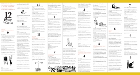
So how could I try to capture this? For two 6-hour periods on two separate days, I sat in the Piazza S. Donato and watched what was happening around me. I recorded everything I could see or hear and at first the simple act of needing to look and write was enough to occupy me. But slowly, after a few hours, my mind shifted in a way that’s difficult for me to describe precisely to you right now. I suspect it was akin to moving into a meditative state. I noticed more detail, found myself wondering about the stories behind the people I saw. I made connections or made them up anyway and questioned much more than I thought I would.

Here’s a short portion of what’s described on this map, which is designed like a broadside. Here’s a sample passage. This is from 6:00 pm on October 14, 2012 from a bench in front of the Palazzo Alemanni. The weather was sunny with some clouds.

The man’s drawing is good. Pencil only, but his subject is Antonio’s bruschetteria, not the church as I first thought. A little boy is being scolded by his mother for digging in the gravel dirt of the piazza. She cleans his hands roughly and he cries when she picks him up and plops him in his stroller. Another little boy is curious. He circles the nearest Etruscan column, running up now and then to take a peek at the artist. “Mama, viene qui! Guarda!” he calls and his mother comes to look. A toddler runs up and down the church steps, amazingly steady. Is this how Italian women learn to walk on cobblestones in heels?

Five dogs are suddenly in the piazza. The cats stare but don’t budge. They know they live here. The little girl walks past me, interested in what I am doing. She says something in Italian and I smile, unable to communicate with a 4-year old. Craig comes by to tell me he just realized his camera can pan left to right, not just right to left. He needs another month! The artist’s companion (because now I’ve decided they are a couple) walks by to see if the drawing is done. It is not. A dog pees at the base of one of the Etruscan columns. I wonder how many millions of times that has happened. The kids are back. Not once has the artist ever looked up at them, not one glance. Is this good or bad? The little boy jumps around and accidently kicks the conté crayon box. “Matteo!” his father yells and swats him. The sound of Matteo crying. “No, Matteo, va bene,” the artist says, smiling but still not looking.

A young woman in black spandex and a bright green top is sitting on the church steps, taking a selfie. Two older women pass by. They could be sisters. Same glasses, hair, scarves. One is using a cane. They seem confused. The man in the red sweater is back in his spot in front of the church, this time near the far right door, which is closed. Four people are suddenly right in front of my table, cameras raised. Where did they come from? R.E.M.’s “Losing My Religion” is playing inside Da Peppone’s. The sun has gone back behind the clouds. A pack of cyclists, all men, all wearing branded Italian jerseys ride past me on the cobbled street that rings the piazza. Only one bumps his bike down to ride in the graveled area. Six women, all with Orvieto water bottles, leave La Tonna souvenir shop and cross the piazza toward me. Three of them stop to examine the bottom of their shoes. “Madonna, Madonna,” they repeat to each other.

Anna comes out of Da Peppone’s, checking to see if there is anyone to serve. There is not and she goes back in. A pigeon flies into the open window at La Tonna. Another is on the roof of Antico Forno. I hear “Where should we eat?” in English for the first time this morning. The bell tower chimes twice. Father Stefano arrives at the church, dressed in black and carrying two black bags. The calico cat crosses the piazza diagonally, followed by the Japanese man and his photographer girlfriend. They’re laughing. Father Stefano is putting the new October mass schedule in the display board. The man in the red sweater is suddenly at his side, talking, and I realize now that he is the sacristan that I met a week ago when I was visiting inside the church last week with Liza and Craig.

A man dressed all in black heads towards the bridge, carrying a dented silver hard suitcase. A 6-foot tall Japanese woman appears, calling to her group. A man crossing the piazza stops to hug his wife. She carries a set of keys and is smoking. They smile and laugh together. A tabby skitters past me, followed by a calico. Two smokers walk past my table. I smell their cigarettes. Sounds of clinking dishes come from Da Peppone’s. Anna must have customers but I didn’t see anyone go in. Maybe she’s cleaning? One of the Americans rests his black backpack on the Etruscan column near the bell tower just as it chimes seven times. A second later, the bells begin their longer ringing, signaling the Angelus. It’s 7:00 pm.

civita_saints and saviors

During my NIAUSI fellowship, I knew I wanted to pay tribute to some of Civita’s most famous figures in some way, including the contributions made by the late Astra Zarina, who established the University of Washington’s Italian Hilltown program in Civita and handled restoration projects for in some of its first buildings in the late 60s, leading the wave of reclaiming these beautiful structures.

Yet it was impossible and possibly inauspicious, to evade ecclesiastical associations while in Italy. Eccola. Civita’s most famous son, Bonaventura. Chapels and statues to him seem to be on every corner in these two towns. Bonaventura was born Giovanni Fidanza around 1221 AD in a house no more than 20 meters from the Palazzo Alemanni where Zarina taught her “Continuity and Change” programs to architecture students for 30 years.

Bonaventura and Zarina both traveled widely, but both reliably returned to Civita. When she died in 2008, Zarina was buried in Bagnoregio, not very far from a church where in 1490 Bonaventura’s right arm was placed in a reliquary made from gold and silver donated by the people of the town. That event is celebrated every year on March 14—today.

What better way, then, to pay tribute to both Bonaventura and Astra Zarina then to map the trajectories of the lives of two of Civita’s saints and saviors? The map is not meant to be definitive by any means, but instead highlights the overlaps and intersections of two lives and one place.

civita_iconography

Andy and Lana Wachowski are best known for writing and directing the “Matrix” trilogy and by all accounts are natural filmmakers. According to a New Yorker article, both siblings count “2001: A Space Odyssey” as one of their earliest influences. The family was apparently huge movie fans, of all genres. Twelve-year old Lana recalls initially hating “2001” because she was perplexed by the mysterious presence of the black monolith. Her father explained simply, “That’s a symbol” and the article recounts Lana’s reaction: “That one sentence went into my brain and rearranged things in such an unbelievable way that I don’t think I’ve been the same since…it’s one of the reasons I’m a filmmaker.”

Now, granted, perhaps not every 12-year old child will respond to symbols this way, but I believe a contributing factor is that we don’t cultivate that type of visual seeing and learning early enough in our educational systems. But the anecdote resonated with me because in Civita I was struck by the complex overlays of symbol and iconography there. Admittedly, this is probably the case in many countries whose historical timeline extends back beyond the 1700s but it felt particularly close to the surface in Civita and very much a part of daily life.

As designers know, the advantage of symbols is that they speak a universal language. I do not need to be conversant in Arabic to understand that the Kaaba represents a significant concept to Muslims. I might not be able to fully articulate the subtleties of its meaning, but I can understand the power and centricity of it as a symbol in one of the world’s great religions.

Once these symbol sets pass into the realm of becoming archetypes — ideas or ways of thinking inherited from all these sources and present in your subconscious — they begin to function as a complete set, as iconography—the collective use of symbols and visual images by a certain culture or group.

Symbols and iconography can be like road maps, leading or guiding you toward a desired goal, encouraging certain behaviors or effects. Each passing generation, utilizing the same symbol, builds up a stronger energy from that symbol with the most effective ones lasting through the ages. Obvious examples include the Christian cross, the yin/yang symbol, the pyramid, and the ankh. It is no coincidence that certain of these symbols from ancient civilizations continue to be an integral part our society, even to the point that corporations use them in commercials, movies, and logos.

Iconography is expert at unlocking a stream of memories, data, emotions and beliefs, sometimes whether we want them or not. That’s why people often choose to pray in a church setting when they could just as easily do so at home, or feel they can mediate more successfully in a space carefully designed to induce a contemplative state.

That I would create an iconographic map of Civita was almost a foregone conclusion and the result is probably one of the more traditional maps in the series. Yet even here, I conflated content since Civita’s three very distinct layers of iconography—historic, religious and vernacular symbols—often mix.

The Etruscans, the city’s first inhabitants and the Romans who followed, were both cultures that understood well the power of symbols and used iconography extensively for protection, fertility, wealth, birth and death rituals. In fact, one of the first things the Romans did on their relentless march to conquer the ancient Etruscan cities was to smash their black clay wear which was heavily decorated with symbols.

For a palpable look into this iconography “mix” you need look no further than Civita’s main piazza and its beautiful Medieval church, the Chiesa S. Donato. Iconography was an integral part of Christian life, and in Italy, it survived, despite the seventh and eighth centuries Iconoclasts demanding their destruction. [bishops keys] In tangible ways, you can see not only the layering of symbols, but also symbol “borrowing” as well as active incorporation of artifacts from one culture to another. [rosette] Rosettes—which many scholars believe derived from the Etruscan paterna or mundus, the symbol of the ever-present life-force—abound as decorative elements. Roman sarcophagi, frieze fragments, and corbels [sarcophagi and corbels] are set into the lower outer walls of the church and the nearby bell tower. Going even further back, the physical divisions of the four contrade correspond to the Etruscan layout of the ideal city, a circle divided into favorable and unfavorable areas.

This amalgam of past incarnations of history, religion and everyday life, along with the addition of some beautiful palimpsests, is mapped on the iconographic map and unified by a tufo background, which in Civita is a welcome constant.

civita_treasures

In 1883, Robert Louis Stevenson published a fictional tale of adventure about an expedition to an unnamed Caribbean island to recover a treasure that had been buried there. Treasure Island is action-packed, has a huge cast of characters, and begins with a map.

Ever since its publication, Stevenson’s map has had readers asking, “Where is Treasure Island?” even when they are told it is an imaginary island that doesn’t exist. How could they not? Maps are guides. We trust them. We look to them to help us find what is desirable, navigate the unknown and avoid the dangerous. They can make unreal place seem real, and real places more manageable.

In Civita di Bagnoregio, for many reasons it’s very easy to believe you are in an imaginary place. The backstory that is history here is sometimes so deep, so hard to comprehend in real time, that it begins to feel unreal. Once, the twin cities of Civita and Bagnoregio were a single city, along with a lively merchant neighborhood between which has since totally disappeared, swallowed up by landslides. Now they are separated by a deep chasm, and joined only by a narrow footbridge. Very few maps unite the two again, but when you’ve spent some time navigating back and forth between the two, it quickly becomes clear that one could not exist without the other. Civita is why the tourists come, and Bagnoregio thrives, in part, to serve those visitors.

But Civita also has a day-to-day life as well, which can be easy to overlook. During my two months there, I often watched tourists come into town, snap a few pictures, and be on their way back out in an hour. They pay little attention to the richness of history here, and zero attention to the fact that there are “real” people here—merchants, masons and carpenters, cooks, priests, and seismic workers— living out their daily lives.

I wanted people to notice. So I decided to create a treasure map of the city. I knew that I wanted to unite Civita and Bagnoregio once again and to include everyday treasures as well as historic ones because taken together, all seemed necessary to feed a traveler’s body and soul.

Can strangers use this map to navigate Civita’s numerous treasures? Absolutely. All the information about historic, architectural, and natural wonders is there. Everything mentioned is open to the public. But interspersed are also some personal treasures, which befits a casual, fun map like this one— my favorite spot for affogato, which ATM wouldn’t reject my card, and the gatto who decided he was mine for two months. Because in the end, what we each decide to include on the treasure maps of our lives will always be as personal as the places we visit and the experiences we have there.

civita_doors

For visitors in any context, doors hold a special significance. As I worked my way through some of the archived materials from the University of Washington Italian Hilltowns Program housed in the Civita Institute’s Sala Grande, it was clear that I wasn’t the only one interested in doors and gates and windows. But a noticeable difference was the focus of the interest. Student projects documented architectural styles, details, age, and construction materials. My interests lay more along the lines of the enormous variety of doors in Civita. Every door seemed to have its own particular beauty that it carried along with its long, imagined history.

The ancient Romans had advanced architectural elements and were known to have used single, double, sliding, and folding doors. In fact, the Roman god Janus is the god of doors and doorways, which makes him of course, the god of beginnings and endings. So I began my discovery process with doors.

Doors also symbolize transitions. At the simplest level, a doorway represents movement from one place to another, but in religion, mythology and literature, it can also depict the passage from one world to another. A deeper personal meaning arises when doors, gates, and passageways serve as symbolic transitions for individuals experiencing change. Nearly everyone has a memory of stopping to take a deep breath before crossing some kind of threshold—an interview, a meeting with a teacher or mentor, or a dining room filled with laughing, happy people, none of whom we know.

Taking that step across a doorway means you’ve crossed a boundary. It might be a place where two places (or cultures or experiences) meet, or taking chances and leaving the past behind. These were all appropriate musings for a visitor in Civita and rich mapping material. In composition and layout, this map reflects these concepts of intimate and outsider; public or private as well as mapping locations and offering architectural styles and details.

Timelines are a staple of exhibit design, providing a way for viewers to grasp a condensed glimpse of what usually is a huge body of information. Mounting an exhibition without a timeline is akin to leaving out the donor wall. To provide context for the series of maps of Civita di Bagnoregio,  I offer this visual time-map. Click on this link (or the image below) to view an interactive Prezi of Civita’s 3000 year history.

civita_time map

Here in Civita, time stretches far into the distant past. Pre-history begins 2 million years ago when the tufo that is this region’s primary building material was formed during the Pleistocene age.  The site itself has been continuously inhabited for over 2,500 years, first by the Etruscans, then the Romans.

“Civita” simply means “town” and in central Italy, you will often see it appended to the name of various places, such as Civita Castellana and Civitavecchia outside Rome. But in early usage, the word, derived from the Latin civitas, designated the oldest and most built up area in order to distinguish it from neighboring villages. If a location was called “civita,” the designation meant that it was a place of some importance.

In the Middle Ages and Renaissance, Civita looked much the same as it does today. A saddle of land connected present-day Civita to Bagnoregio (known then as Rota) with the Convento di S Francisco occupying the middle ground before it was lost to an earthquake. Together, the population numbered close to 1,800 citizens. Starting in 1695 and continuing for over 100 years, the city endured a series of devastating earthquakes, landslides, locust infestations, and malaria. By 1800, more than 40% of Civita’s land mass had been lost. Although the rate at which the city continues to crumble is glacial, the process continues through to today. “The clay soil here falls away like fresh ricotta,” says Erino Pompei, the mayor of Bagnoregio until 2009, whose name bears an eerie resemblance to another lost Italian town.

In 2012, I received the Astra Zarina Fellowship from NIAUSI, The Northwest Institute of Architecture and Urban Design in Italy which allowed me to spend two months living and working in Civita di Bagnoregio, a World Heritage hill-town in Lazio, Italy whose roots date back nearly 3,000 years to the Etruscans.

civita_getting here

On Friday, March 14th, I’ll be presenting my project, Civita immaginata: Mapping a Historic Landscape at NIAUSI’s Fellows Festival along with Liza Mickle, Don Fels, Isabel Sitcov and Alan Maskin at an afternoon seminar at SRG Partnership in Seattle, followed by an evening reception and auction at NBBJ Seattle.

As a designer, first and foremost, I organize information and try to make sense of sometimes very dissimilar things. But I’m also a storyteller, and this dual persona was a primary component of what I wanted to bring to Civita when I set out to create a series of maps that would attempt to make my own personal sense of a very special place. And this is probably as good a time as any to put out a disclaimer that I am not an architect or an historian so there are likely errors in some of these maps for which I take full responsibility.

So, why maps? Why not a series of posters or brochures? For designers as well as the general public, maps provide one of the primary ways of making sense of a place. But maps can also help us grasp deeper concepts, detect patterns, prognosticate. Civita immaginata invites viewers to go beyond what is depicted on the surface, to examine the many layers of meaning, culture and history that exist in one place.

Traditional maps are essentially arbitrary selections of information yet as users, we assign great ambitions to them. Implicitly, we trust them to help us navigate and make sense of the world. Quite often they succeed but sometimes in a controlled, coded language, and for many people who don’t how to analyze the data, they’re often complex and hard to understand. I wanted to see if a broader view of mapping, one that included an emotional component, might increase their accessibility for viewers, not just to their content but to their understanding of place.

In traditional societies, there was no need for maps. Words and memories built history, and what was “known” was transmitted from memory to memory. Yet this need we have to define the areas we explore and inhabit, to mark our territory, to organize it and often, change it seems fundamental. Map designers always need to make choices: what to leave in and take out. Everything goes through a kind of cartographic surgery, through layering of texture, color, image, text, symbol. Fortunately, we’re generally so familiar with the language of maps that we trust them, and mapmakers can take some liberties. But to map is to lie, since there is always a bias, always a point of view both literally and figuratively. Oscar Wilde said, “Every portrait that is painted with feeling is a portrait of the artist, not his sitter.” Maps are like portraits—mysterious, sometimes abstract and sometimes deliberate exaggerations. Not only is this to be expected but in my opinion, it adds to the character of maps, creating an open-ended invitation for viewers to enter.

I’ll be sharing my project results in a series of posts over the next week, as well as some thinking on my map-making process and would love to hear your thoughts.

two_and_two_miro-quotester

The Miro display has opened at the Seattle Art Music, and there’s more than meets the eye. This partner in design went to see the follies of Miro.

I can’t help but post a few of these, they’re delicious and preposterous! Concoctions whipped up by Andy Warhol, his mom, and Suzie Frankfurt. I couldn’t resist and just located a used copy, it should be here in a few days… in time for the holidays. The book condition described a stain on the back cover… I wonder from which recipe.

I’ll will post a few drawings of my Thanksgiving feast. If you do a food drawing we’ll post it here and make our own collective visual feast.

wildraspberries_warholfrankfurt1wildraspberries_warholfrankfurt11wildraspberries_warholfrankfurt12wildraspberries_warholfrankfurt10wildraspberries_warholfrankfurt7wildraspberries_warholfrankfurt6

BBG_Website

The Bellevue Botanical Garden is an 53-acre refuge, filled with cultivated gardens, restored woodlands and wildlife, designed to reflect a unique urban Northwest landscape known as Cascadia, with Puget Sound to the west and the Cascade mountains to the east. Our identity, signage and print work with the Garden recently expanded to include a full redesign of the Garden’s web site, the primary portal for visitors to learn about this Northwest treasure. The site offers special sections on the history of the Garden, seasonal “What’s in Bloom?” resources, information on sustainable gardening techniques as well as a Capital Campaign fundraising page dedicated to funding the Garden’s new Visitor Center set to open in late 2014. The new site also includes a separate section where visitors can access and the vast array of gardening resources at the Garden through a custom-designed plant database.

BBG_Plant_Search

World_Vision_Your_Gift

World Vision is a Christian humanitarian aid, development, and advocacy organization dedicated to working with children, families, and their communities worldwide to help children reach their full potential by tackling the causes of poverty and injustice. Partners n Design has worked with World Vision USA, headquartered in Federal Way, WA for many years, producing print materials for their Sponsorship and Donor Engagement. Recently, we were thrilled to work on a very different kind of project: Journey of a Special Gift, a short video designed to help explain to donors where and how special gifts made to their sponsored child are processed. Our approach employed an engaging mix of still photography, typography and animated graphics designed to simplify and enliven a complex process. Watch the two-minute video here.

Ostara

The Ostara Group is a perfect client for Partners in Design. Ostara works with small to midsize nonprofits, our own client base for many years, providing hands-on organizational and fundraising support and helping these vital organizations realize their full potential. When Ostara approached us to design a new web site for them, we were thrilled. The site is designed for client-access CMS and includes a separate blog area where Ostara’s partner specialists can contribute their expertise and advice.

SJCLB_Website

The story of the San Juan County Land Bank is one of history, regional pride, resourcefulness and independence in the San juan Islands, a rich archipelago just north of the city of Seattle. For centuries, islanders have feasted on clams, hunted for deer, picked berries, dug bulbs, and fished waters teeming with salmon. On gentle slopes they planted large orchards with pears, plums, apples, and cherries. In 1990,  in order to ensure that the distinct character of life in their islands would endure, island residents created the San Juan County Land Bank, with a mandate to preserve areas in the county that have environmental, agricultural, aesthetic, cultural, or low-intensity recreational value. Partners in Design has worked with the Land Bank since their founding, designing their identity, print publications, annual reports, maps, land management identification and interpretive signage, and their first online presence. At the Land Bank web site visitors can learn more about conservation management and stewardship of the islands as well as access extensive maps for walking and enjoying Land Bank public access properties.


BM_wicked

This is what Barry Moser, the great book illustrator, said to a young artist. He is one of my visual heroes and I’d like to share this quote along with a Moser illustration appropriate for the upcoming holiday “spirit”. When you look at some of Barry’s work it can make you shiver with only the fight between light and dark.

“When I was young, perhaps around your age, I was bored in school, so I stared out the window daydreaming about being home with my dog or building a model. I had a problem with my eyes and didn’t read very well. It was embarrassing when I was called on to read aloud. Reciting my times tables was even more mortifying. I was the last to be picked to play ball at recess, but the first to be chosen to work on the Thanksgiving mural—drawing was the only thing I did well, and I did it at home hour after hour.

I did not go to kindergarten. I started school in the first grade and went six years to public school. Then I went to military academy in the seventh. My family was not rich, so it was a privilege to attend such an elite school. However, the academics were very demanding, sports were required, and military drill as mandatory—and there were no art courses. Not one. In fact, I was often disciplined for drawing, for “wasting my time.” My family wanted me to become a military officer or a medical doctor. Anything but an artist. My daddy told me that I could never make a living at art. But I persisted in spite of his discouragement and today I live a marvelously happy and comfortable life. So, my young friend never let anyone tell you that you cannot do something. You can. All it takes—and this is a lot—is the desire to do it, the persistence to learn how to do it well, the courage to stand strong when people around you are discouraging your dreams. And perhaps most important of all is being willing to fail while you are trying your hardest—but then to pick it up and start over again.”

—Barry Moser

Enter your email address to follow this blog and receive notifications of new posts by email.

Archives